Why Redesign
AutoProctor was launched to solve a major problem during the start of the Covid pandemic: teachers could not ensure fair online tests. AutoProctor helped solve this problem by using A.I. to conduct fair online tests. Its technology detects whenever a student is using any unfair means during an online test. For over a year, AutoProctor spread through word of mouth. But as the startup grew, it needed a stronger identity and online presence. The website for AutoProctor at the time was pretty barebones, the copywriting and design were not compelling enough, and the site was not responsive. AutoProctor also launched a new feature for developers to bring A.I. proctoring abilities onto their own testing platform. We needed a good user flow for developers to experience and onboard this technology.

Objectives
- Prominent Call-to-actions on the landing page to encourage users to try the AutoProctor app.
- Responsive design that works across devices of all sizes.
- Have a modern and fun visual design language.
- Designing a playground for developers to experience the tech before committing to subscribing.
- Stronger copywriting to convert users to try AutoProctor.
The Redesign


Responsively Designed

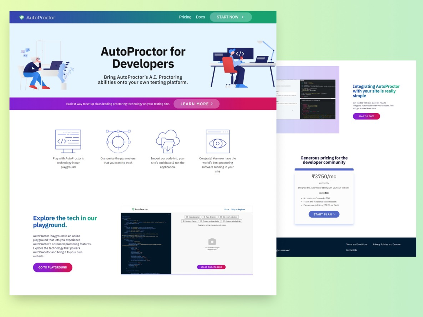
The Developer Playground
We designed a playground for developers to experience how AutoProctor works without buying a subscription plan and installing the code on their site first. To make sure that the users convert to paying customers and do not drop off, we made this a seamless process, where after experiencing the product, they can register and get started with bringing the tech to their testing platforms.

AutoProctor for Developer Site

Some of my work during this project is under an NDA, so please get in touch with me if you have any questions or want to chat further about my experience.
